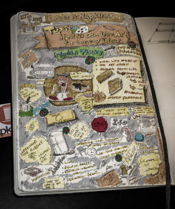
One of Beer and Napkin’s purposes is to provide learning opportunities to expand our understanding of “visual literacy.” At the November 11, 2014 Meetup Bridget Kirkland, Designer at Kirkland Designs and Instructor at USC Upstate and Designer Russell Tripp facilitated thought-provoking dialogue on How We can use Art to convey Ideas. Thanks to Russell for outlining some of the thoughts below from the session. Also, thanks to B&N advisor Paul Hebert for sharing his thoughts and sketchbook from the session.
The conversation started with Bridget sharing a number of personal visual and creative resources:
- Here is a list of Bridget’s book suggestions in case anyone missed them (Bridget, please correct/add if any are wrong or missing, thanks.):
- Ways of Seeing by John Berger
- The Creative Habit by Twyla Tharp
- Steal Like an Artist by Austin Kleon
- The Art Spirit by Robert Henri
- Drawing From Life: The Journal As Art by Jennifer New
In addition, Russell mentioned the book Drawing on the Right Side of the Brain by Betty Edwards. This is an excellent book for people who think they can’t draw. Anyone who can learn any other skill can learn to draw as well.
2. Set a regular schedule to practice, grab a journal and start sketching regularly
3. Be vulnerable and share your work with others. Learn from others on techniques, style, and general approach.
4. Act like you are 5! Bridget shared her experience being hypnotized by an artist into thinking she was actually 5 years old. She said the spirit in which she drew an image without inhibitions was the best ever!
5. There is no truly “universal” imagery or visual language beyond the most fundamental geometric shapes and primary colors (see Piet Mondrian). To create imagery that is readable (understood to mean the message you are trying to convey) to a particular audience, you must first understand that audience and their “lens”. That audience can be expanded by finding some, perhaps not immediately obvious, common ground within the diverse group you are trying to communicate with.
6. Understanding of your visual message can often be enhanced by simplifying the images used. Less unnecessary data means less chance of personal differences in interpretation.
7. Visual literacy incorporates a set of skills that can be trained just like any others, and which, combined with an analytic mindset, determine our level of visual literacy. Russell’s personal recommendation for improving visual literacy is to learn the fundamental elements and principles of design – there really aren’t that many – (http://goo.gl/1EcUK) and use that knowledge to analyze what you see and when you’re discussing it with other people. One way to have the opportunity to do both (and learn a surprising amount about human history and human nature) is to study art history (http://smarthistory.khanacademy.org/).
8. When creating a visual that we wish to convey a clear message, the onus is on us as the sender/creator of the message to be sure the visual message is understandable to the audience. Audience matters – design your visuals in terms of the recipient not the creator.
9. When developing any sort of visual message, sketch/try/work out lots of ideas before deciding on what to use. Get the obvious ideas out of the way first. You might come back to them, but give yourself options to choose from to find what’s right for your audience.
10. Remember that everyone projects their own emotions, experience, and understanding onto visual imagery when interpreting it. This can be valuable knowledge in designing specific visual messages when you understand your audience and simplify the design to allow this kind of projection.
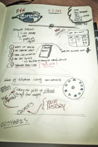
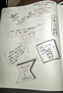
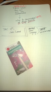
Sample of Paul Hebert’s Sketchbook notes from the evening


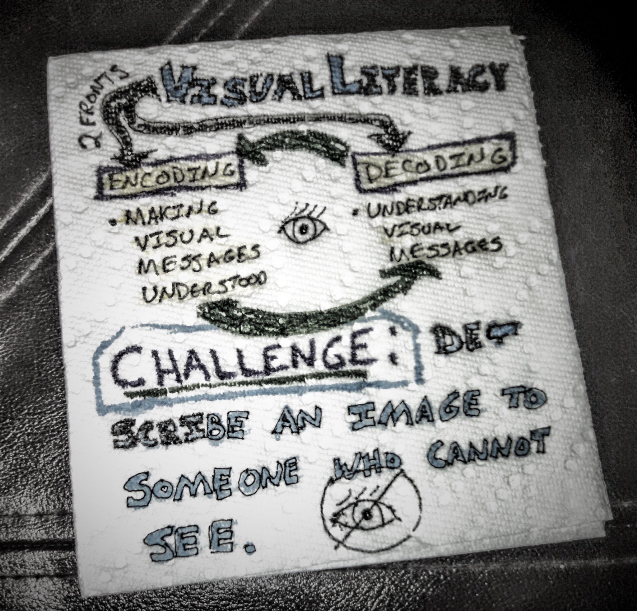
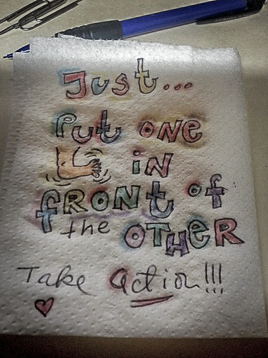
Phil McCreight’s Sketchnotes
